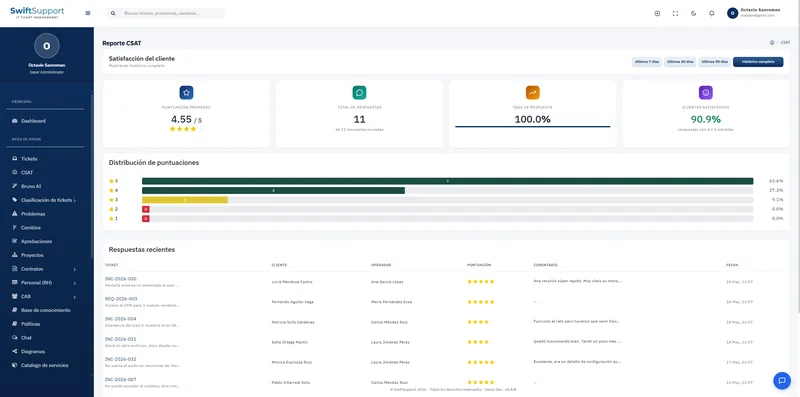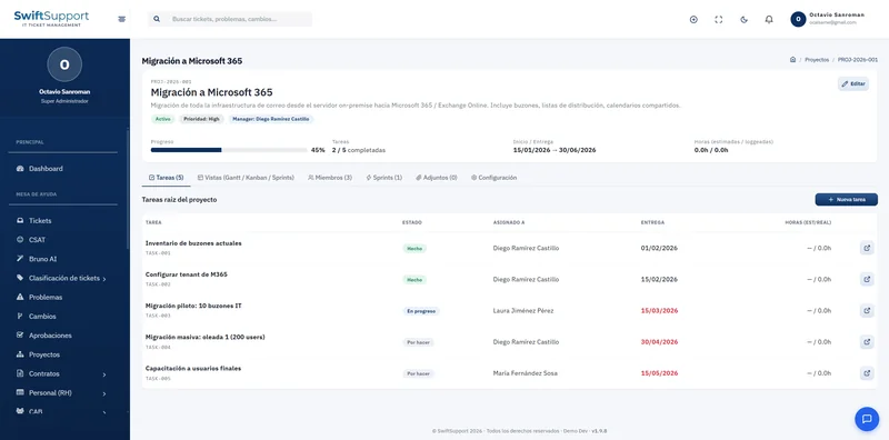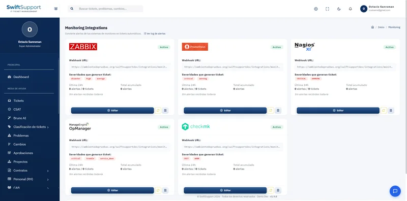

Your entire operation on one screen. The dashboard shows the key indicators and charts a supervisor needs to make decisions, always current and filterable by period.
What it is and how it helps
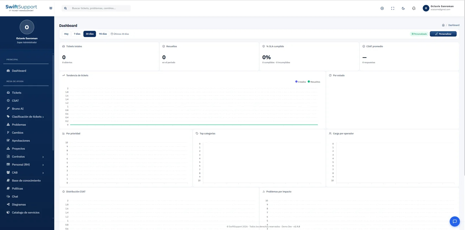
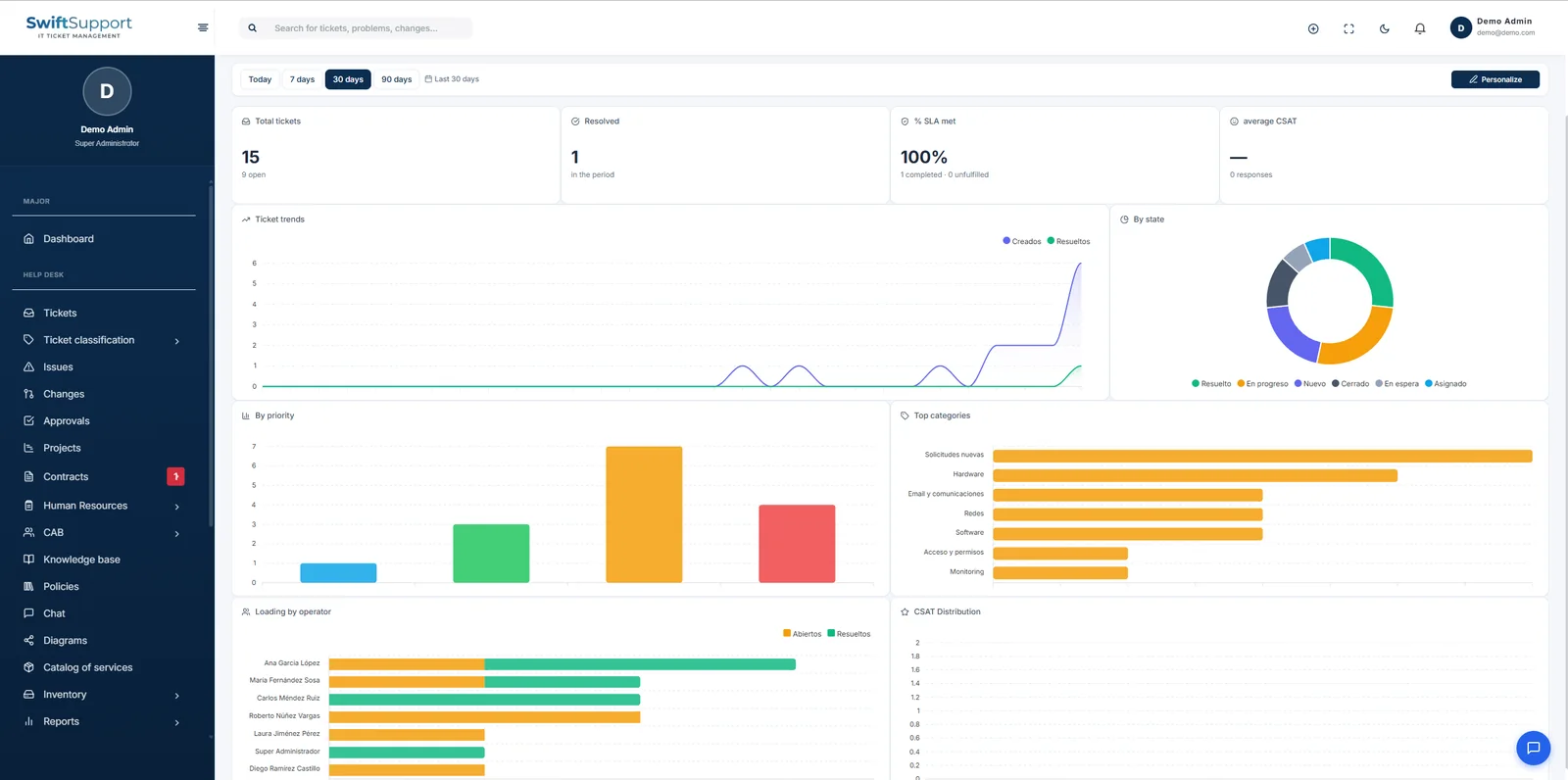
At the top, four indicators sum up the period: total tickets, resolved tickets, SLA compliance percentage and average CSAT. With one click you switch the range between today, 7, 30 or 90 days.
Below, the charts answer everyday questions: the trend of tickets created versus resolved, the breakdown by status and by priority, the categories with the most tickets, workload per agent (open and resolved), the CSAT rating distribution and problems by impact.
The Customize button lets you choose which widgets to show and in what order, so everyone sees what matters to them. Active announcements also appear on the dashboard, making it the natural starting point of the day.
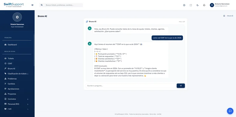
When an indicator stands out —a spike in one category, an overloaded agent or a drop in CSAT— the next step is one click away: dig deeper with report templates, run a precise query in the SQL Runner or ask Bruno AI what is going on.
Key capabilities
Period KPIs
Total tickets, resolved, SLA compliance % and average CSAT.
Ticket trend
Created versus resolved over the period.
By status and priority
How work in progress is distributed.
Top categories
What is generating the most tickets.
Workload per agent
Open and resolved tickets per person to balance the work.
CSAT distribution
Satisfaction ratings for the period.
Problems by impact
Visibility into problem management.
Customizable widgets
Choose what to see and in what order.
How it works
-
01
Choose the period
Today, 7, 30 or 90 days.
-
02
Read the indicators
KPIs and charts update for the selected range.
-
03
Dig deeper
Move on to reports, the SQL Runner or ask Bruno AI.
-
04
Customize
Tailor the widgets to your role and priorities.